
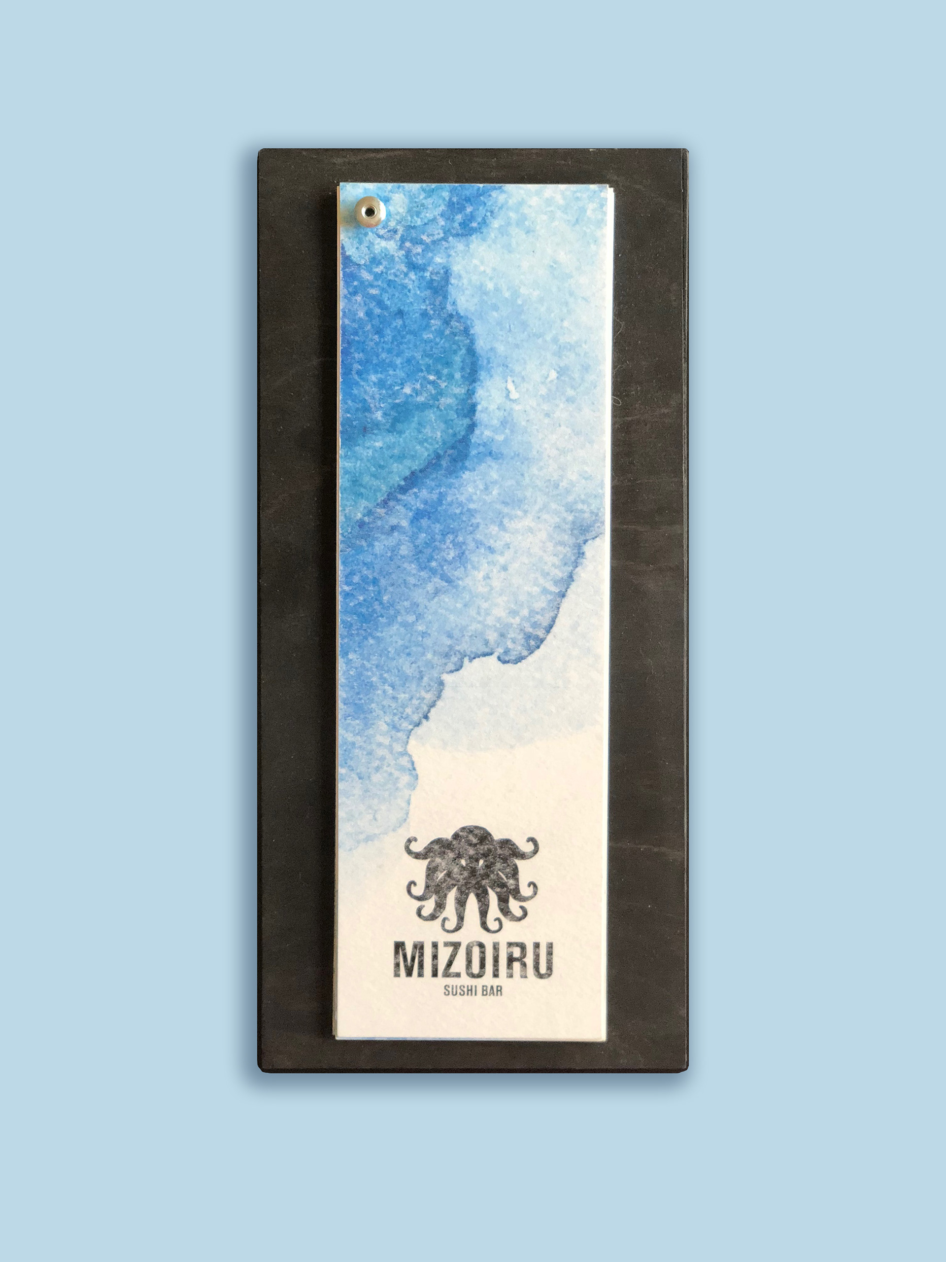


Mizoiru is a local sushi resturant that needed an overall branding redesign. This project aimed to create a logo that better captured the ambiance of the business; a hip establishment filled with dim ocean-like lighting and
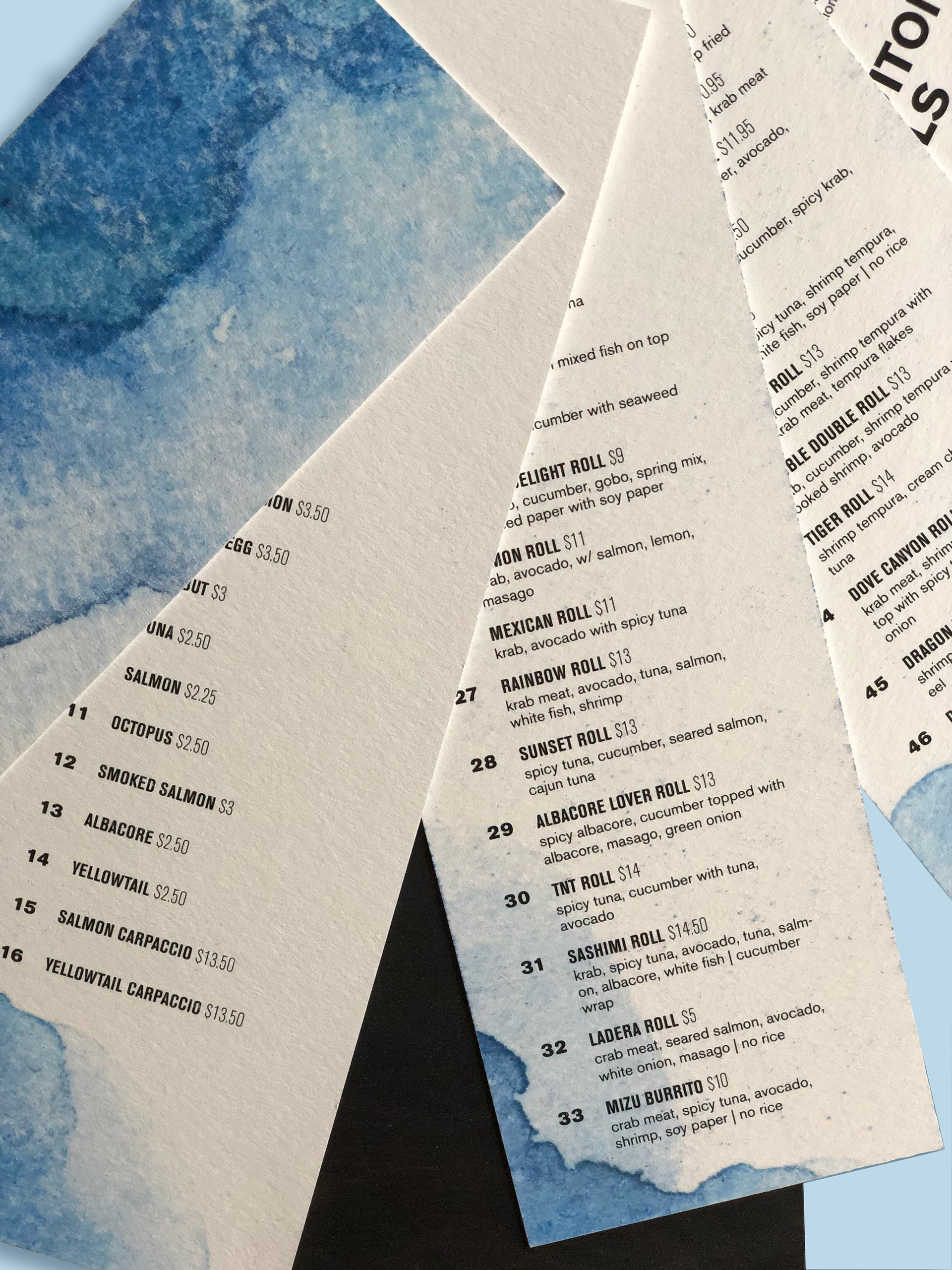
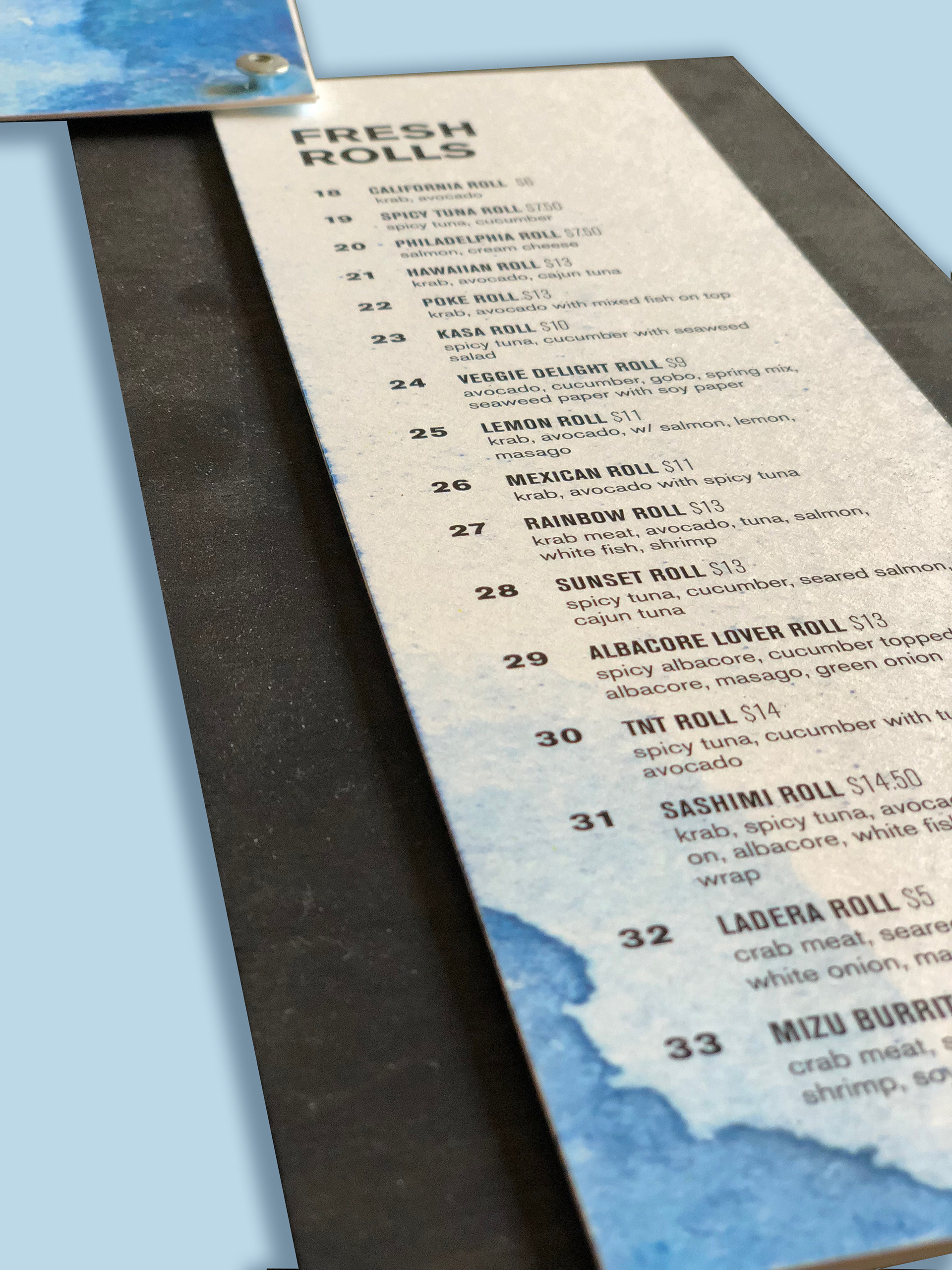
dark colors. The previous menu was a dull laminated checklist of sushi options. The new menu is printed on thick watercolor paper and fastened on a stained wood panel. Menu items are easier to read and aesthetically pleasing to the consumer.
dark colors. The previous menu was a dull laminated checklist of sushi options. The new menu is printed on thick watercolor paper and fastened on a stained wood panel. Menu items are easier to read and aesthetically pleasing to the consumer.